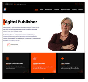
Lingo@work had been struggling with the design of their website for a while. It didn’t give the look and feel, they were looking for, to attract the customers they wanted. That’s why they asked me for a consultation in which we tried to discover together what kind of design they need in order to attract the right customers they want. We eventually came up with a minimalistic but clear design that allows the visitor to go smoothly through the website. Are you in the target group of Lingo at work? Then contact Lingo at work. If you do not belong to their target group, you will will quickly notice that so you do not have to contact them. It saves time on both sides.
Mireille has designed a nice website www.lingoatwork.eu. Absolute craftsmanship!!
Are you also not satisfied with the design of your website, but you can’t exactly pinpoint what it is that’s missing? Book a free consultation and we will take a look at your website together.


